


Unique Medical Spa Logo and Promotional Materials
The client was interested in using French minimal style in their brand identity.
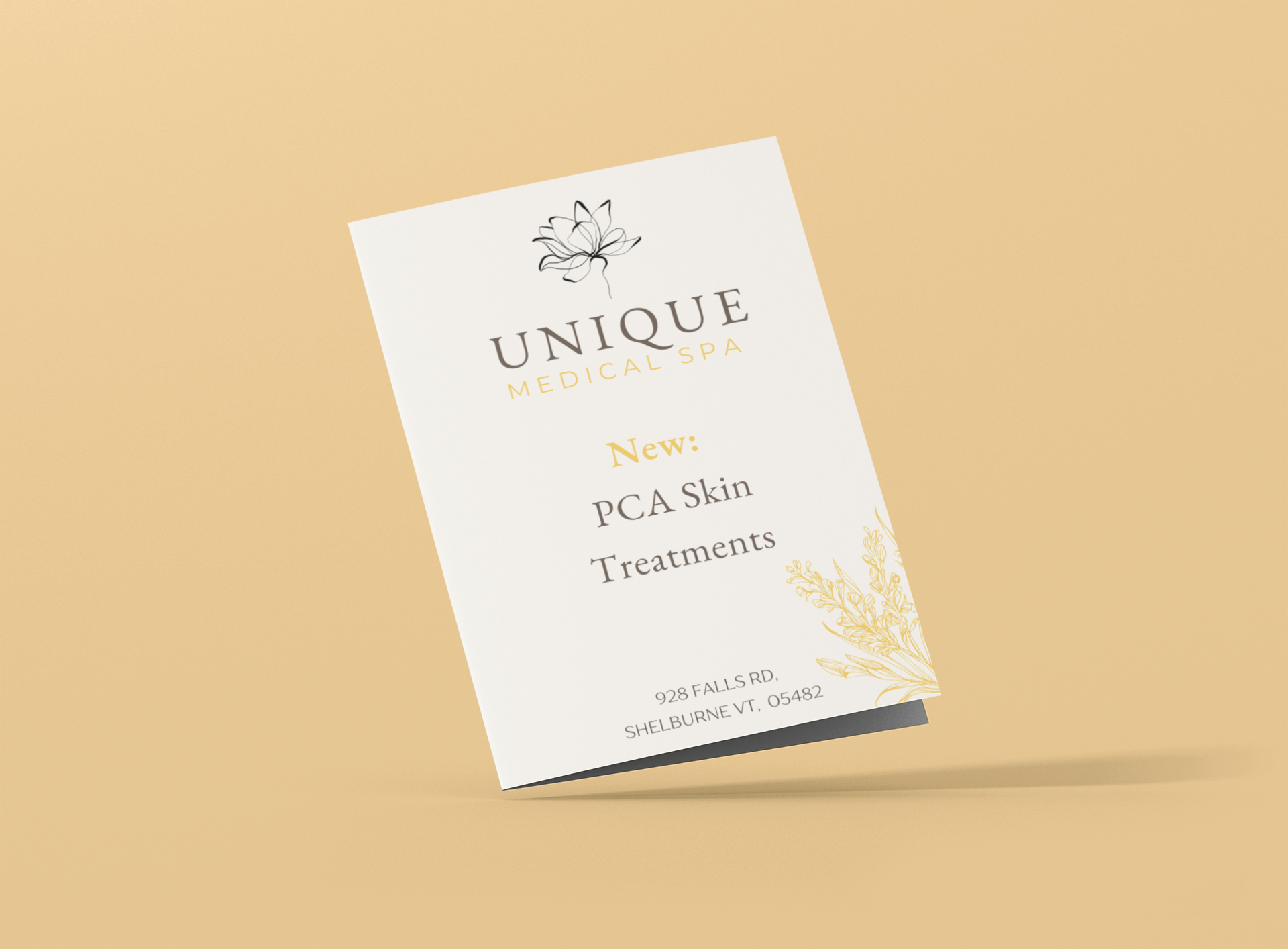
The client was looking for a calming coffee house feeling which inspired the color palettes of soft browns and yellows.
Keeping true to that concept, I wanted to create a clean look with warm and romantic elements. I wanted to keep the type on the thinner side, and the logo simple and dainty.
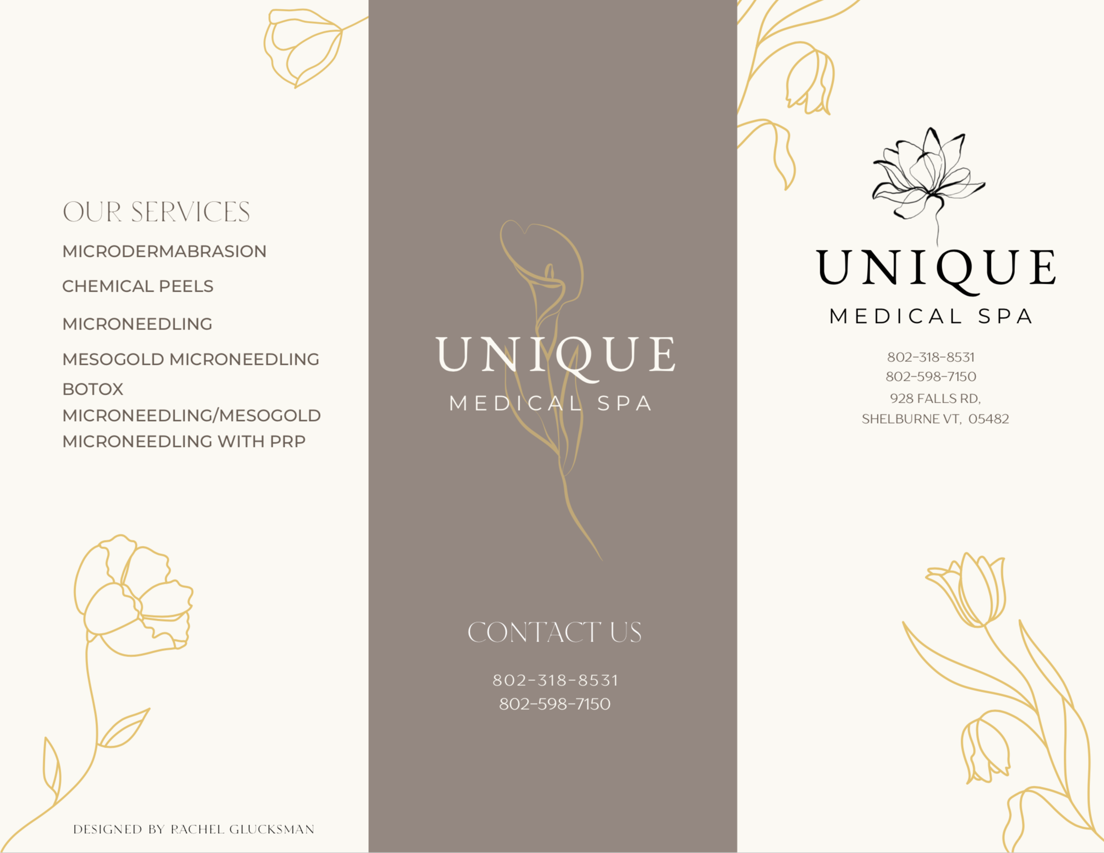
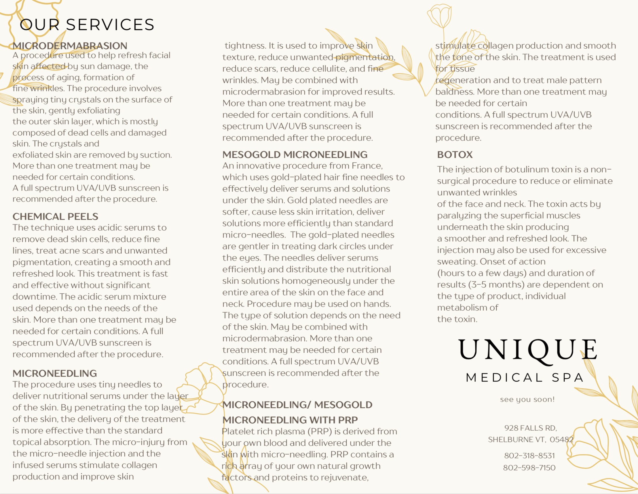
For the summer pamphlet, I added bright colors and graphics to give it an exciting summer feeling, inspiring the reader to refresh their look as the seasons change.
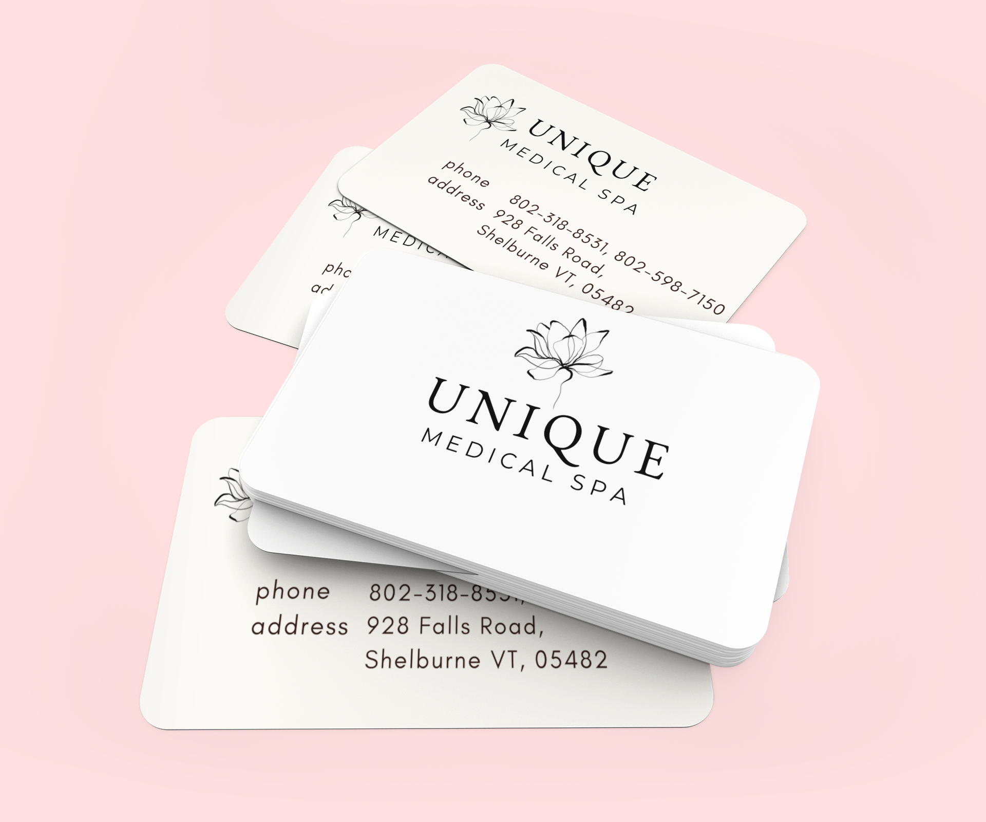
The client was looking for a calming coffee house feeling which inspired the color palettes of soft browns and yellows.
Keeping true to that concept, I wanted to create a clean look with warm and romantic elements. I wanted to keep the type on the thinner side, and the logo simple and dainty.
For the summer pamphlet, I added bright colors and graphics to give it an exciting summer feeling, inspiring the reader to refresh their look as the seasons change.